Insert Colors: Pairing With Your Dial
Author: Funny Items
Release time: 2026-08-25 19:16:22
View number: 14
Color Theory for Bezels
The right insert color elevates a dial; the wrong one fights it. Here is the pairing logic.
Pairing Principles
| Dial Color | Strong Pairings | Why |
|---|---|---|
| Black dial | Black/red, blue/black gradient, full black | Tonal depth or single accent pop |
| Blue dial | Navy/blue gradient, silver-text | Analogous harmony reads expensive |
| Green dial | Green/black, olive tones | Monochrome green is the modern flex |
| White/silver dial | Red/blue Pepsi, black | Contrast energizes neutral dials |
| Bronze case | Brown/bronze, olive, black | Warm metals want warm accents |
The One-Accent Rule
Allow one strong color moment per watch. A blue dial + red-accent insert competes with itself. If your dial has colored accents already, echo them in the insert — don't add new hues.
Aluminum vs Ceramic Changes Math
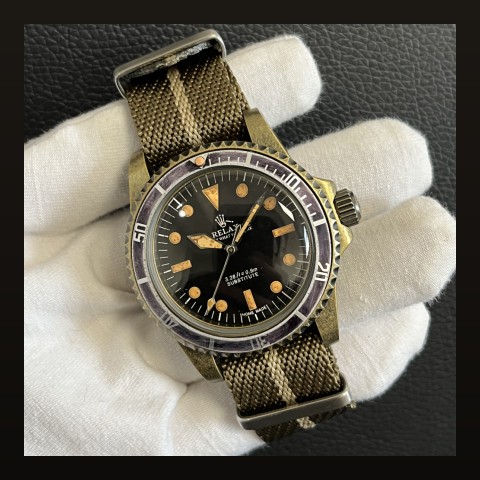
- Ceramic renders colors more saturated/vivid
- Aluminum softens and will patina toward vintage tones
- Same "black" insert looks different across materials — check photos in both finishes
Sizing rules in our insert sizing guide; swap technique in the replacement guide.
Frequently Asked Questions
Most versatile insert color?
Black with silver or white markings — pairs with everything and never dates.
Can I mix metal accents?
Gold-accent inserts on steel-cased builds work when the dial carries gold text too — coordination beats matching.