Insert Fonts: The Typographic Choice
Author: Funny Items
Release time: 2026-08-25 22:19:32
View number: 10
Insert Typography Matters
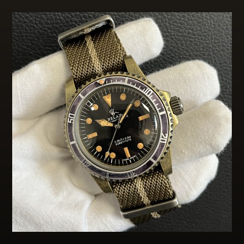
Bezel insert numerals come in distinct typographic styles — each changing the insert's whole character.
The Numeral Styles
| Style | Character | Found On |
|---|---|---|
| Classic serif numerals | Traditional, formal | Vintage-inspired dive builds |
| Bold sans-serif block | Modern, tool-watch | Contemporary divers |
| Minimal markers only (no numbers) | Clean, instrument-like | Minimalist builds |
| Custom fonts | Premium signature look | Luxury references |
Matching Insert to Dial Typography
- Serif insert + serif dial text = coherent vintage voice
- Bold sans insert + clean modern dial = contemporary coherence
- Mixing serif insert with sans dial text reads as parts-bin build
Dial text conventions in our layout guide; pairing logic in the color theory guide.
Frequently Asked Questions
Do fonts affect legibility?
Yes — bold sans-serif numerals remain readable at distance and in motion; thin serifs favor style over function.
Where to see options?
Our collection shows multiple typography executions across models.