Dial Text: The Quiet Conventions
Author: Funny Items
Release time: 2026-08-25 18:57:28
View number: 15
What Goes Where on a Dial
Dial text follows quiet conventions. Knowing them helps you evaluate dials and design custom ones.
The Standard Layout
- 12 o'clock: brand name/logo — the identity position
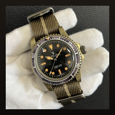
- 6 o'clock: model name, movement origin ("Automatic"), water rating
- Rarely used: sides — reserved for date windows and complications
Text Density Spectrum
| Density | Character |
|---|---|
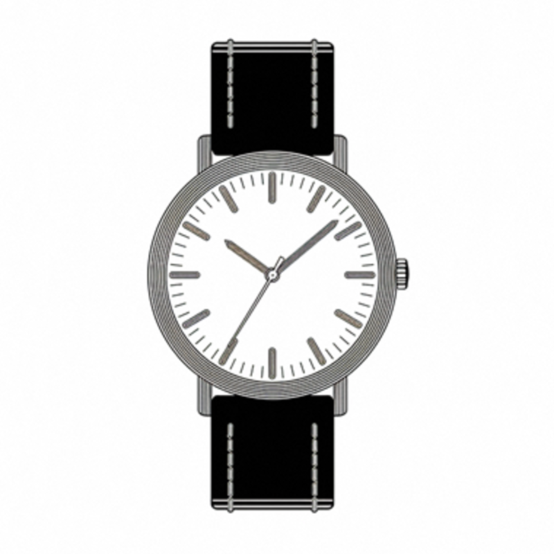
| Logo only at 12 | Pure minimalist confidence |
| Standard two-line | The industry norm |
| Text-heavy | Vintage chronograph character — or clutter, depending on execution |
Evaluating Dial Text Quality
- Alignment: text should sit perfectly level and centered on its axis
- Font consistency: mixed weights signal budget production
- Spacing: even letterspacing separates quality printing from rushed work — see our printing methods guide
For Custom Dial Designers
Keep text under three lines total. Every additional line steals visual space from the indices that tell time. See our custom dial process guide.
Frequently Asked Questions
No-logo dials worse?
No — logo-free is a legitimate minimalist aesthetic. Just expect lower resale recognition.
Keep reading: Sunburst: Light Is the Language