Choosing Watch Hands: Standard, Benz and GMT Sets Explained
Hands Make the Watch Readable
Dials get the compliments, but hands decide whether your watch works. Wrong hand lengths mean dates flipping at noon or minute hands scraping crystals. This guide matches our complete hands catalog to your build.
The Catalog
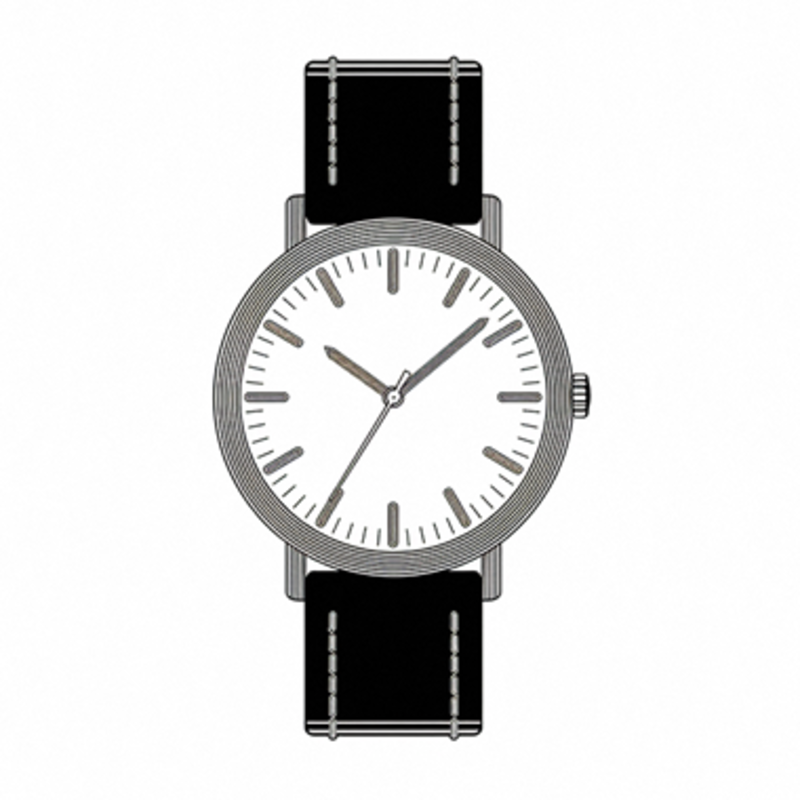
- Hands Set for NH35 Movement — the universal default: hour, minute, second sized for standard NH35 stacks
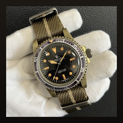
- Benz Hands Set for NH35 Movement — the Mercedes-style hour hand with luminous circle; the most iconic sport hand design
- GMT Hand for NH34 Movement — the fourth-hand upgrade for GMT builds
- Second Hand for NH35 Movement — standalone swap when you only want a colored tip accent
Matching Hands to Dials
| Your Dial | Recommended Hands |
|---|---|
| Classic dive (Full Black) | Standard NH35 set with strong lume |
| Sport/dive with triangle markers | Benz set |
| GMT with 24-hour scale (NH34 GMT Dial) | NH35 set + GMT hand |
| Dress dial (White Glossy) | Slender standard set, minimal lume |
Installation Rules That Prevent Regrets
- Press at true 12:00 — set the movement to exactly 12:00 before pressing each hand
- Hour first, then minute, then second — each with the correct press die size
- Check clearances — rotate the hour hand fully around; it must clear the date window frame and any raised markers
- Test the date flip — advance past midnight; the date should snap between 11:55 and 12:05
New to pressing hands? Our hands changing guide walks the whole process, and the tool kit list covers the press you need.
Lume Matching Matters
Hand lume should match dial plot brightness. Mixing super-bright hands with dim dial plots makes the hands float oddly in the dark. Our sets are formulated to match the dials we sell.
Frequently Asked Questions
Can I use Benz hands on any dial?
On any NH35-platform dial, yes — post sizes are standardized within the platform.
Why did my date flip early after a hand swap?
The hands were pressed slightly off 12:00. Pull them and re-press aligned exactly.
Second hand color — does it matter functionally?
Purely aesthetic, but high-contrast tips (red, yellow, white on black) genuinely aid readability.